Data Analysis: From Raw Data to Insights

In our field—whether you are debugging a distributed system, hunting for security anomalies, or optimizing software performance—we are often drowning in data but starving for insights. "Data Analysis" is not just a task for data scientists; it is a fundamental engineering discipline. It requires a structured approach to move from raw logs and metrics to a rigorous understanding of system behavior.
This post synthesizes the fundamental frameworks and techniques required to perform robust data analysis, moving from process models to advanced visualization strategies.
1. The Process: Structure Over Ad-Hoc Queries
The biggest mistake engineers make when presented with a dataset is diving immediately into writing queries or generating random charts. Effective analysis requires a lifecycle.
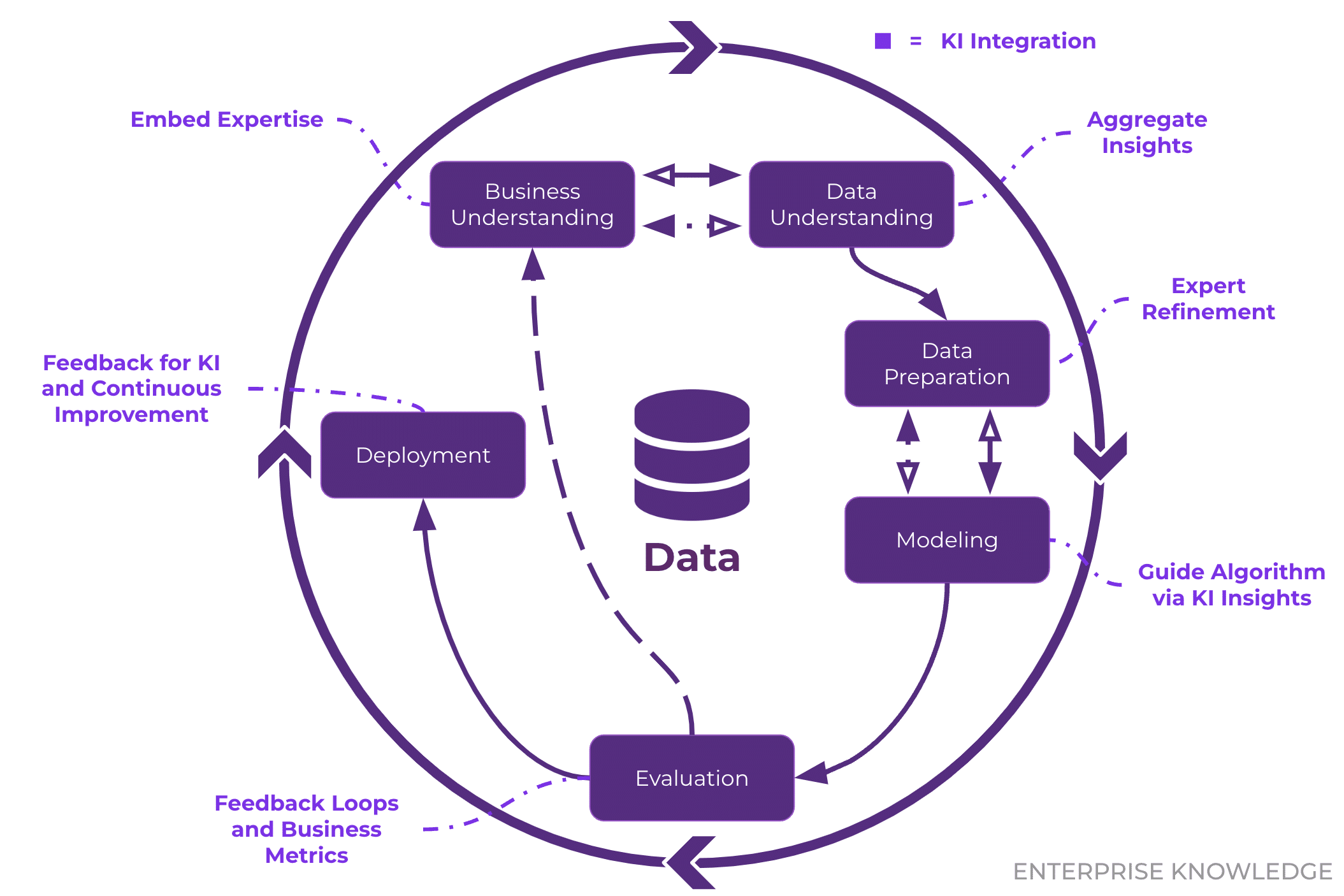
The CRISP-DM Standard
The industry standard, CRISP-DM (Cross-industry Standard Process for Data Mining), provides a cyclical model that applies perfectly to software engineering contexts:
- Business Understanding: Define the objective. (e.g., “Why is the checkout microservice latency spiking?”)
- Data Understanding: Explore what telemetry is available.
- Data Preparation: Clean, format, and normalize the logs.
- Modeling: Apply statistical or machine learning techniques.
- Evaluation: Validate if the model answers the initial question.
Deployment: Integrate the insight into monitoring dashboards or automated alerts.
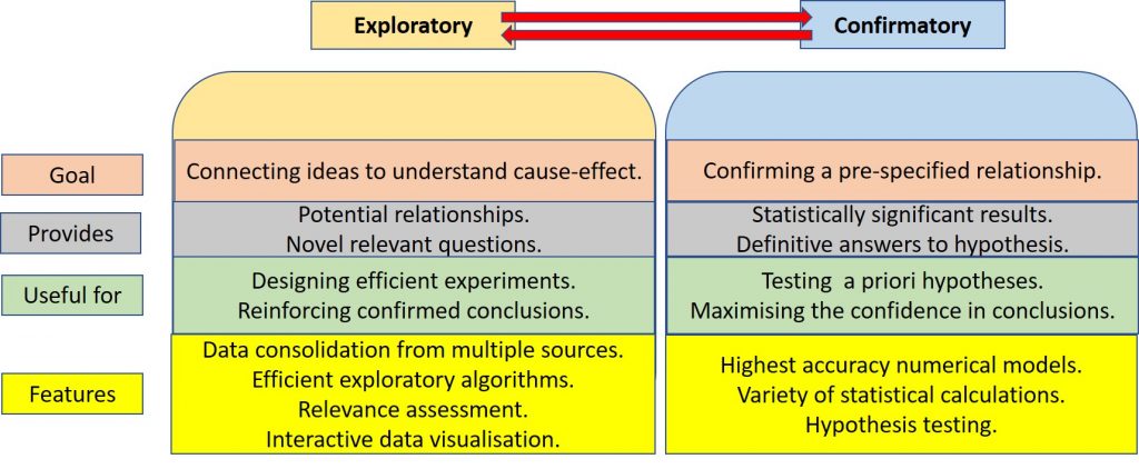
EDA vs. CDA
We must also distinguish between two modes of operation:
- Exploratory Data Analysis (EDA): This is the detective phase. We use summary statistics and visualizations to understand the “shape” of the data without rigid assumptions. The goal is to generate hypotheses.
- Confirmatory Data Analysis (CDA): This is the judicial phase. We take a specific hypothesis generated during EDA (e.g., “Database locks are causing the latency spikes”) and use rigorous statistical testing to reject or confirm it.
Key Takeaway: Never skip EDA. Jumping straight to CDA usually leads to testing the wrong things based on incorrect assumptions.
2. Data Models and Preparation
Before analysis, data must be structured. While we often deal with Graph models (network topologies) or Document models (JSON logs), the Tabular Model remains the gold standard for analytical processing.
The Tabular Standard
- Rows: Represents individual measurements or records (e.g., a single HTTP request).
- Columns: Represents attributes (e.g., Timestamp, IP Address, Status Code).
The Criticality of Data Cleaning
Real-world data is dirty. In security research, “dirty” data (like malformed packets) is often the signal itself, but in general analysis, it is noise. Common cleaning tasks include:
- Handling Missing Values: A
nullin a response time field might mean a timeout, or it might mean the logging agent crashed. These must be distinguished. - Standardization: If one service logs duration in milliseconds (
200) and another in seconds (0.2), your analysis will be flawed. - Outliers: In software engineering, outliers are often the most interesting data points (e.g., the 99th percentile latency). We must decide whether to filter them as errors or study them as anomalies.
3. Dimensions of Manipulation: The OLAP Cube
When dealing with multi-dimensional data (e.g., API requests across Time, Region, and UserType), we use mental models derived from OLAP (Online Analytical Processing) to navigate the dataset:
- Slicing: Fixing one dimension to a single value. Example: Analyzing logs only for
Region=us-east-1. - Dicing: Selecting a sub-cube by constraining multiple dimensions. Example:
Region=us-east-1ANDTime=Last_Hour. - Drill Down/Up: Changing the granularity. Example: Moving from
Dailyerror counts toHourly. - Pivoting: Rotating the axes to view the data from a new perspective. Example: Swapping rows (Time) and columns (Region) to compare regional performance side-by-side.
4. Understanding Variables and Distributions
To choose the right visualization, you must identify your variable types:
- Numerical: Can be Continuous (e.g., CPU load) or Discrete (e.g., number of active threads).
- Categorical: Can be Nominal (e.g., Server ID, Error Type) or Ordinal (e.g., Severity Levels: Low < Medium < High).
The “Average” Trap & Robust Statistics
Engineers are often obsessed with the Mean (Average). However, the mean is not “robust”—a single extreme outlier can skew the entire metric.
- Scenario: You have 9 requests that take 10ms, and 1 request that hangs for 10,000ms.
- The Mean is ~1,009ms. This suggests the system is universally slow.
- The Median is 10ms. This correctly identifies that the system is generally fast, with a specific outlier problem.
Recommendation: Always prefer Robust Statistics (Median, IQR) over non-robust ones (Mean, Standard Deviation) when dealing with performance data, which is almost always non-normal (long-tailed).
The Boxplot
The Boxplot is arguably the most efficient tool for summarizing distributions. It encodes five key pieces of information in a compact glyph:
- Median: The center line.
- IQR (Interquartile Range): The box itself, representing the middle 50% of data (Q1 to Q3).
- Whiskers: Extending to the rest of the distribution (usually 1.5x IQR).
- Outliers: Individual points beyond the whiskers.
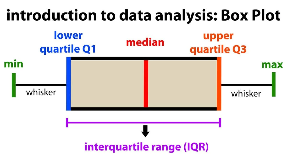
This allows us to instantly see if a dataset is skewed or if it contains significant anomalies.
5. Visualizing Relationships
Bivariate Analysis
When correlating two variables (e.g., Memory Usage vs. Garbage Collection Duration), Scatterplots are the standard. However, they suffer from Overplotting when data volume is high—thousands of points overlapping form a useless black blob.
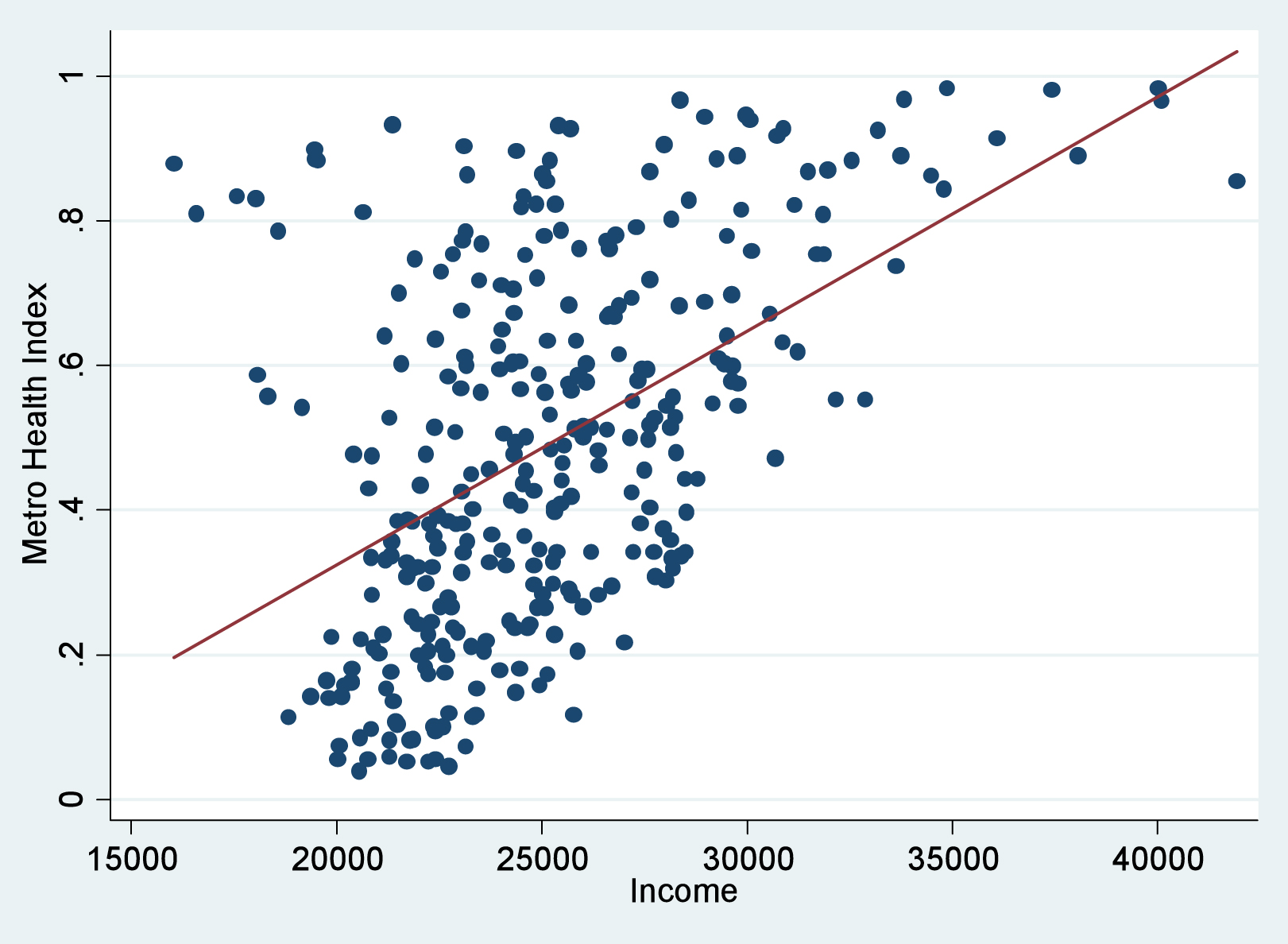
Solutions for Overplotting:
- Jitter: Adding a tiny amount of random noise to separate overlapping points.
- Transparency (Alpha Blending): Making points semi-transparent so dense areas appear darker.
- Binning/Hexbins: Aggregating points into geometric shapes and coloring them by density.
Multivariate Analysis
Complex systems rarely fail due to a single variable. We often need to look at 3+ dimensions simultaneously.
- Correlation Matrix (Heatmap): A grid showing the correlation coefficient between every pair of variables. This is excellent for quickly identifying redundant metrics or strong linear relationships (e.g., identifying that “Disk I/O” and “CPU Wait” are moving in lockstep).
- Parallel Coordinates: A powerful technique for high-dimensional data. Each variable is a vertical axis. A single data point is a line connecting values across these axes. This allows us to spot clusters and inverse relationships across many dimensions, though the ordering of axes is critical to the readability of the chart.
Summary
Effective data analysis is about rigor. It requires:
- Cleaning your inputs to ensure unit consistency.
- Exploring distributions using robust statistics (Median > Mean).
- Visualizing relationships while accounting for data density.
- Distinguishing between exploratory hypothesis generation and rigorous hypothesis confirmation.
By applying these structured techniques, we transform opaque logs into clear, actionable engineering decisions.
Acknowledgment: Based on an interpretation of the “Data Analysis” lecture materials by Andras Foldvari, Budapest University of Technology and Economics.